Football clubs that changed their badges throughout their history
Football badges are more than just visual symbols—they are part of the club's heritage, identity, and connection with fans. Over time, these crests often evolve to reflect modernization, shifts in branding, or a desire to reconnect with historical roots. Let's take a look!
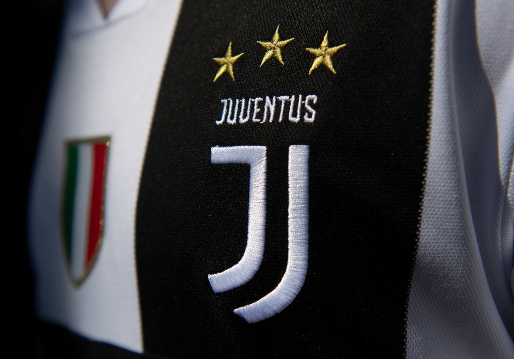
Often referred to as the 'Vecchia Signora' (the Old Lady) by Italian football fans, the Turin team stands as one of the oldest teams in Serie A. It's team logo design has been changed six times, most recently in 2017.
A new minimalist 'J' design that sparked controversy among fans. Cristiano Giuntoli claimed the new logo "aligns with the global branding strategy".
Want to see more like this? Follow us here for daily sports news, profiles and analysis!
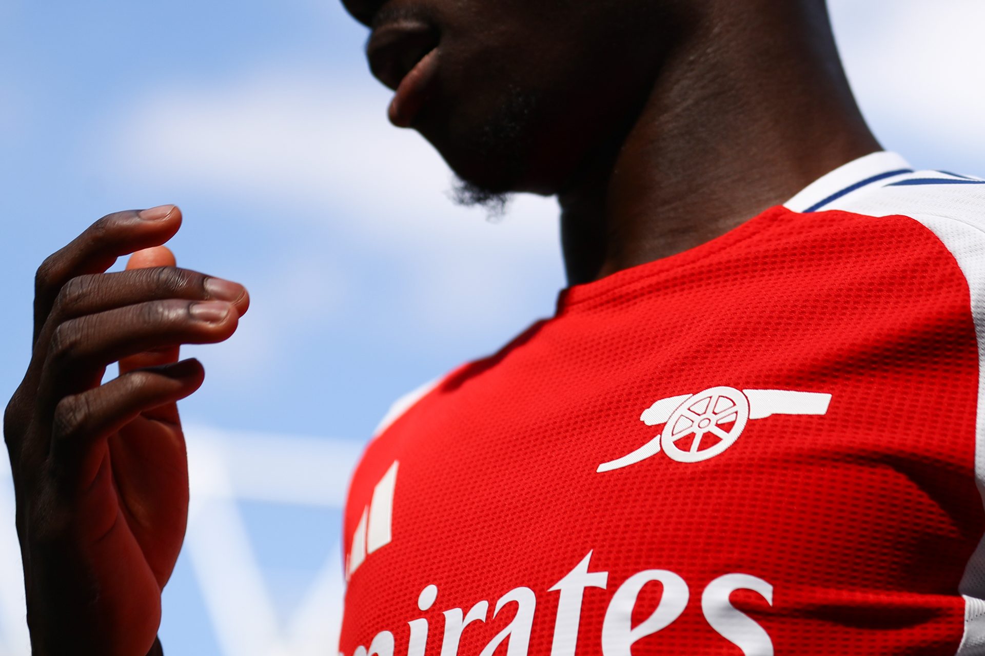
The Gunners also went for a logo update back in 2002. The English giants went for a cleaner, more modern design while still keeping their iconic cannon.
Now, fast forward to 2024, the club wants to simply keep the cannon as the logo, breaking it down to its simplest form.
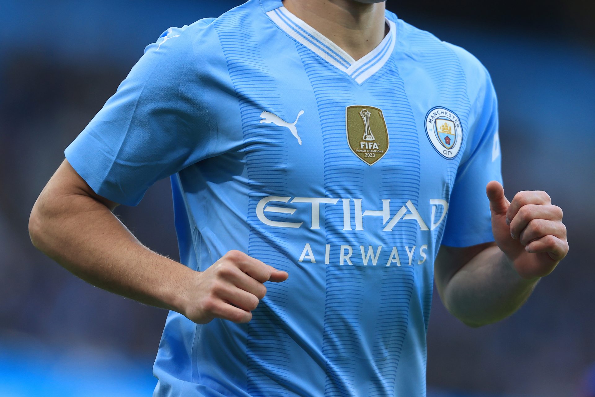
The current Premier League holder went through a 'facelift' too back in 2015, right around the time Pep Guardiola joined the ranks. The club updated to a circular design, paying homage to its 1970s crest.
The Catalan club did some simple design modifications to its club logo. Its original crest dates back to 1912, and the club tends to stick to its original design. Refined in 2018, they reshaped the crest.
The classic Ajax logo will officially return as the club's emblem, starting next season (2025/2026). It will look like the 1928 club logo, displaying the Greek hero Ajax. The Dutch club will "celebrate its 125 anniversary on March 18th. The celebration will include the announcement of the return of the classic logo," shared CEO Menno Geelen in an official club statement.
The Northern Italian team modernized its logo in 2021, generating a greater emphasis on the lines retaining the historic colors.
In 1978, designer Piero Gratton was commissioned to create a new logo for AS Roma, tapping into the city's history. In 1997, the club returned to its original crest and logo, seeing only some minor changes till today.
The London giant underwent some changes. In 2005, the club chose to revert to its original lion logo from the 1950s, alongside its traditional crest. An homage to the clubs history.
Atletico de Madrid modified its logo, changing the crest slightly and simplifying minor details in 2017. However, this sparked major outrage among fans who later wrote a petition to revert the badge changes. "The majority of the 77,690 members who have participated in the vote have chosen to return to the previous badge," shared a club statement in June 2023.
Want to see more like this? Follow us here for daily sports news, profiles and analysis!
The Parisian club simplified its logo in 2013, emphasizing the Paris Eiffel Tower icon alongside new brighter colors. What do you think? Let us know which one is your favorite badge!
More for you
Top Stories


