

Manchester City's 'Oasis Kit' and other infamous kits in Premier League history
An 'interesting' choice
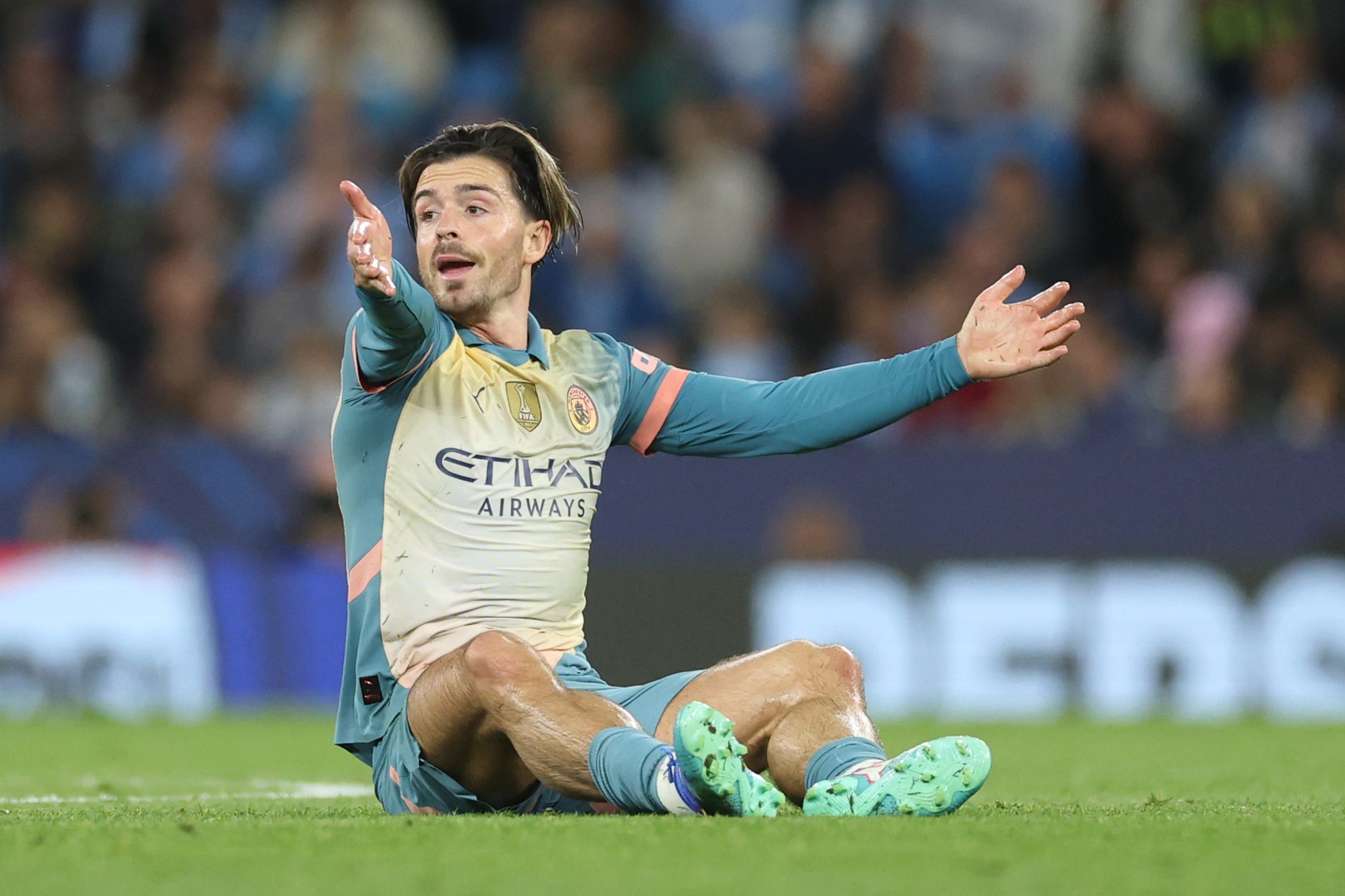
The release of Manchester City’s new Oasis kit has caused quite a stir Unveiled during their Champions League opener against Inter Milan, the special-edition kit – apparently co-designed by Noel Gallagher himself in tribute to his band – features a bold combination of retro design elements and iconic Oasis lyrics.
Questions raised
The shirt immediately sparked debate among fans and pundits, with some praising its unique homage to Manchester's musical heritage, while others questioned its design choices.
A bit old hat?
Although it was meant to celebrate the band's legendary connection to the city and Manchester City’s achievements, many fans felt that the kit leaned too heavily into nostalgia and not enough into modern design sensibilities.
Want to see more like this? Follow us here for daily sports news, profiles and analysis!
Not really fitting the bill
For a team that performs in an almost regal fashion, the kit’s retro vibe was considered by some to be out of place for the reigning European champions.
Where does it sit?
But where does the Oasis kit belong among the worst Premier League shirts ever? Let's take a closer look at where it might rank and revisit some of the most infamous kits in Premier League history.
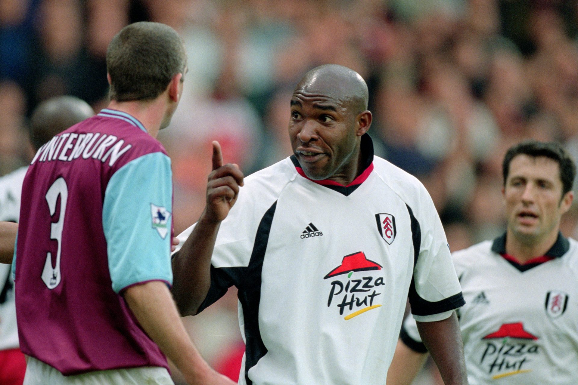
15. Fulham (2001-02, Home)
Fulham’s bold decision to have their sponsor Pizza Huts overside logo just floating against the white background made the kit look more like a moving poster than a kit. Still, Fullham fans love it to this day.
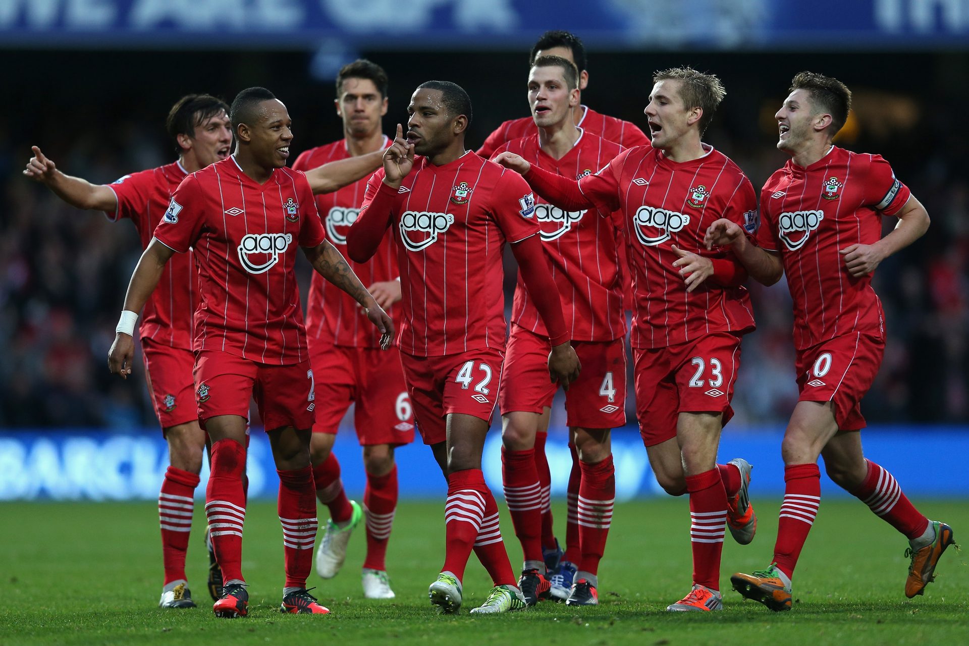
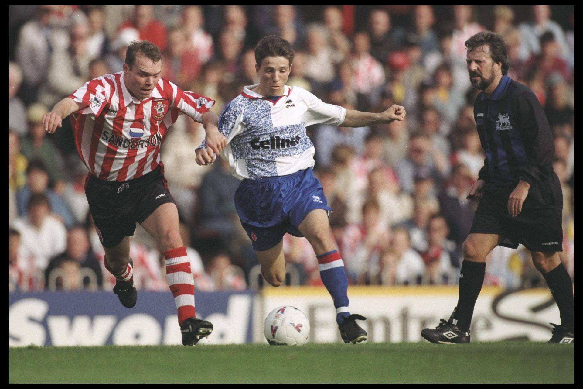
14. Southampton (2012-13, Home)
In a deviation from their traditional red and white stripes, Southampton opted for a mostly red kit in 2012, with white pin stripes. The design was met with disappointment from fans, many of whom felt it lacked the club’s usual identity... or perhaps more crucially, looked an awful lot like Liverpool from the stands.
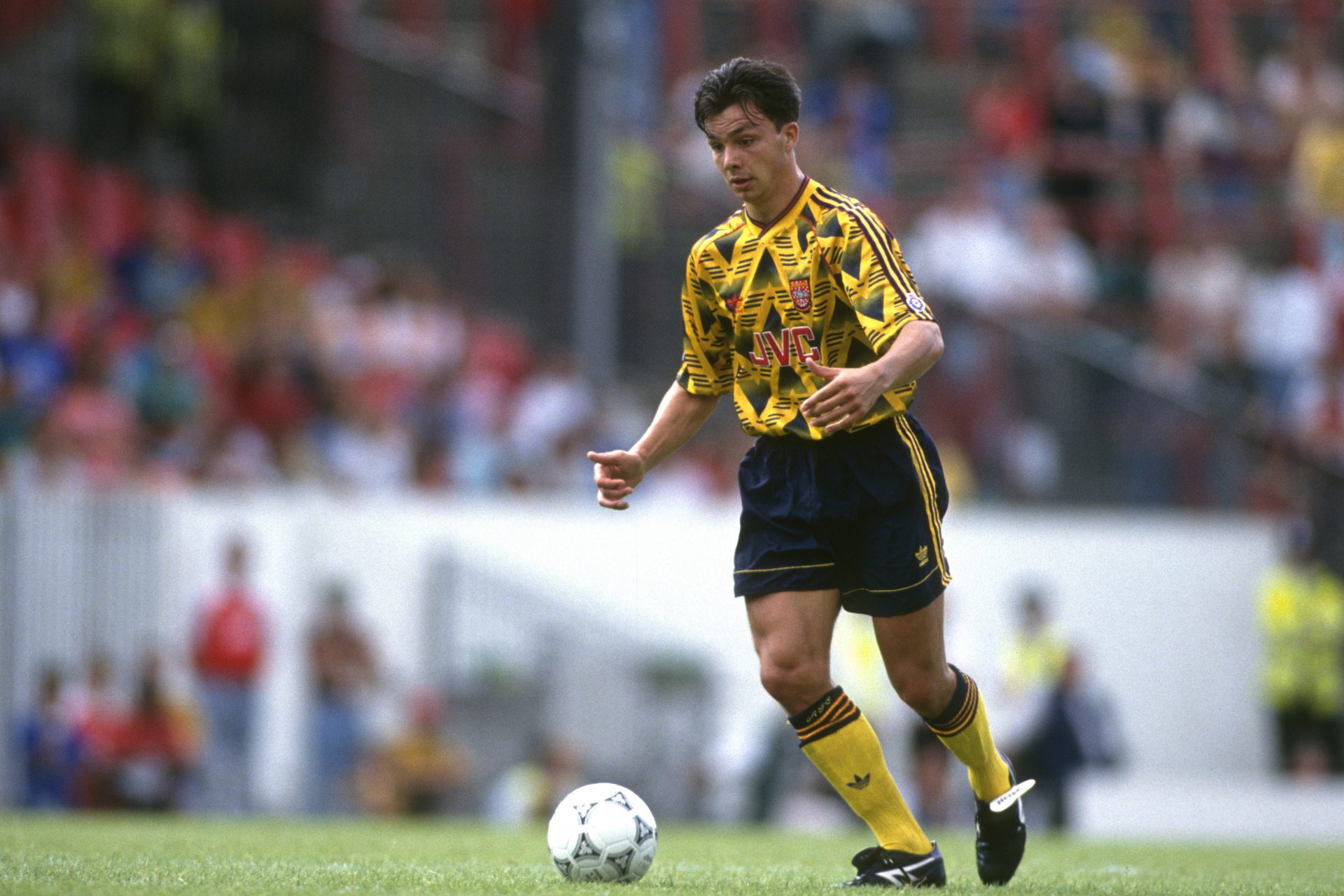
13. Arsenal (1991-93, Away)
Nicknamed the 'bruised banana,' this Arsenal kit is both loved and loathed. Its bright yellow base with diagonal black stripes has often been cited as one of the ugliest designs in Premier League history. We think it's a legit doozy, but it's a bit of fun, innit?
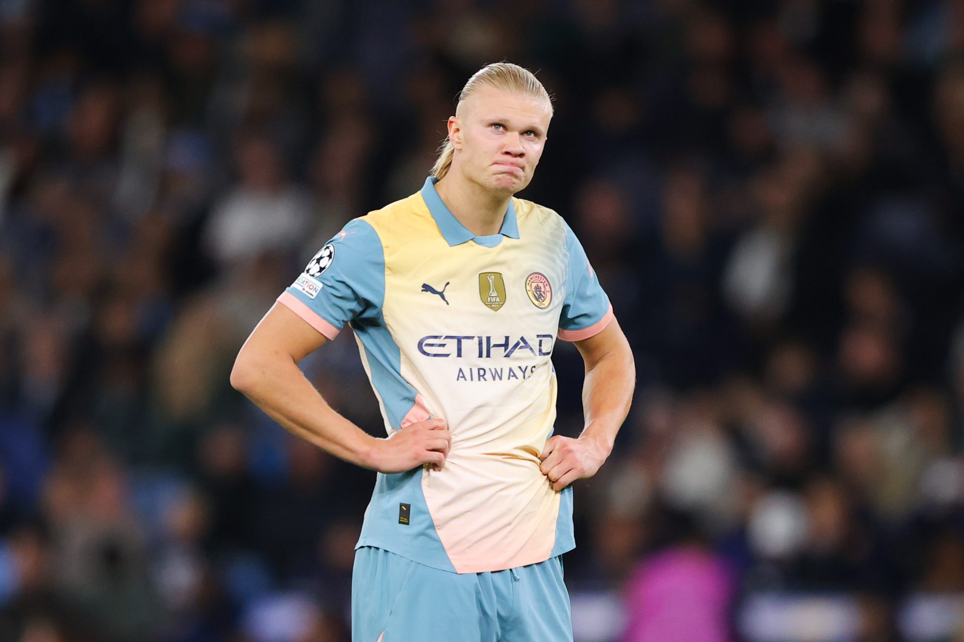
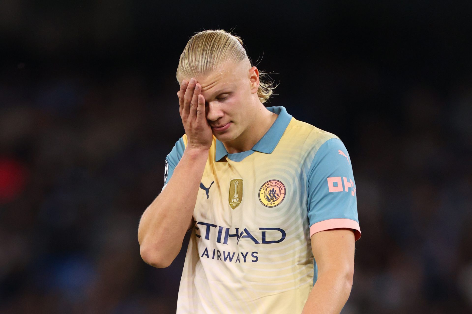
12. Manchester City (2023-24, Third)
One of the latest entries to the worst kits list, again, comes from City. Their third kit for the 2022-23 season baffled fans with its neon yellow color and sloppy black details. For an impossibly rich club, the design was pretty slap dash and cheap.
11. Middlesbrough (1996-97, Away)
This bizarre blue and white away kit, with a diagonal band slashed across the front, was a jarring mix of pattern and placement. Middlesbrough’s crest was oddly placed in the middle, giving the shirt an unbalanced and awkward look.
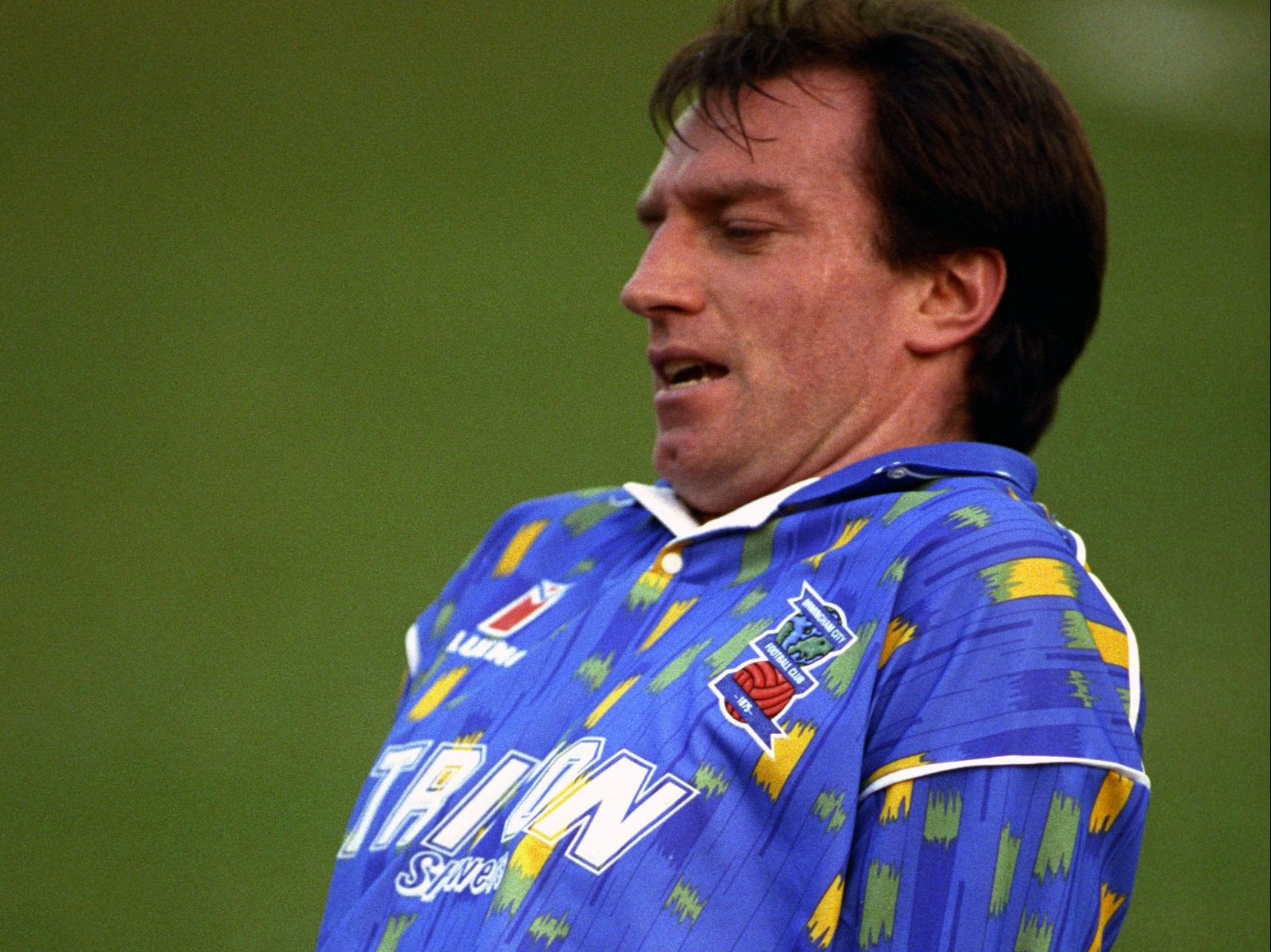
10. Birmingham City (1992-93, Home)
Birmingham City's home kit from the early 90s was another fashion disaster. The shirt featured a bright blue base with some odd-coloured splotches randomly placed all over, making it look more like a painter's overalls than a professional kit.
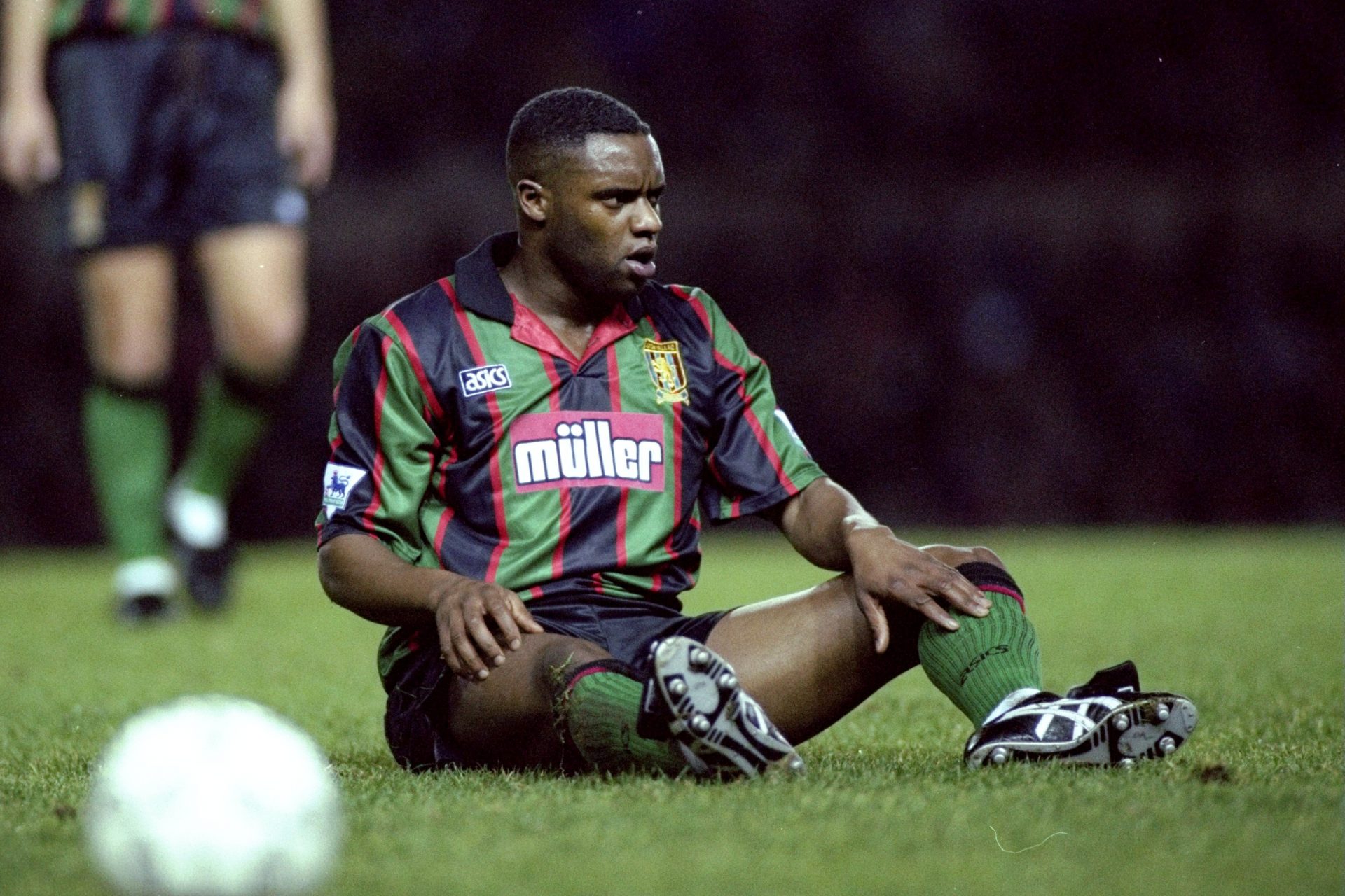
9. Aston Villa (1993-94, Away)
Aston Villa’s green and black stripes with a red badge and logo clashed in all the wrong ways. The busy design and mismatched colors still turn stomachs almost 30 years on.
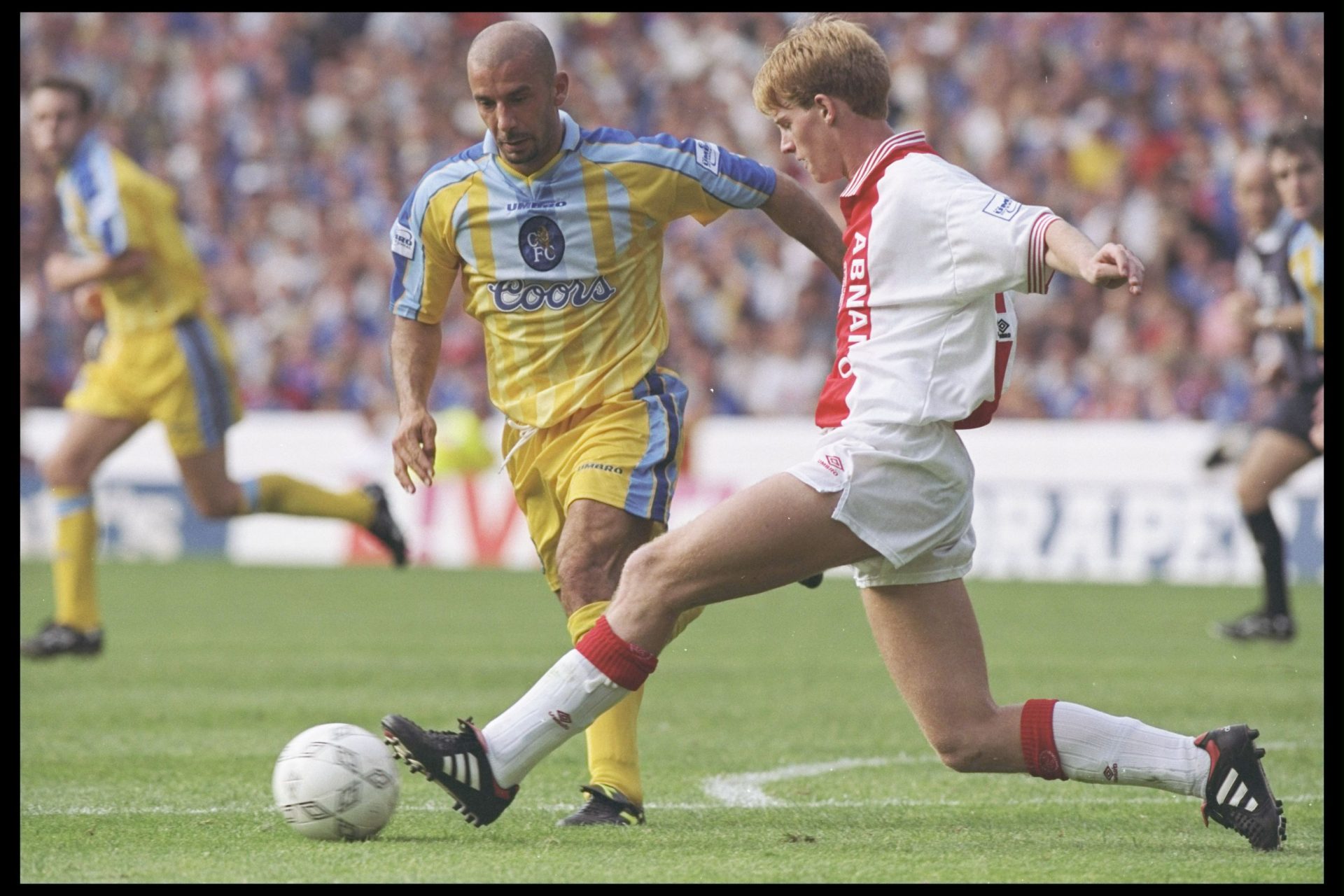
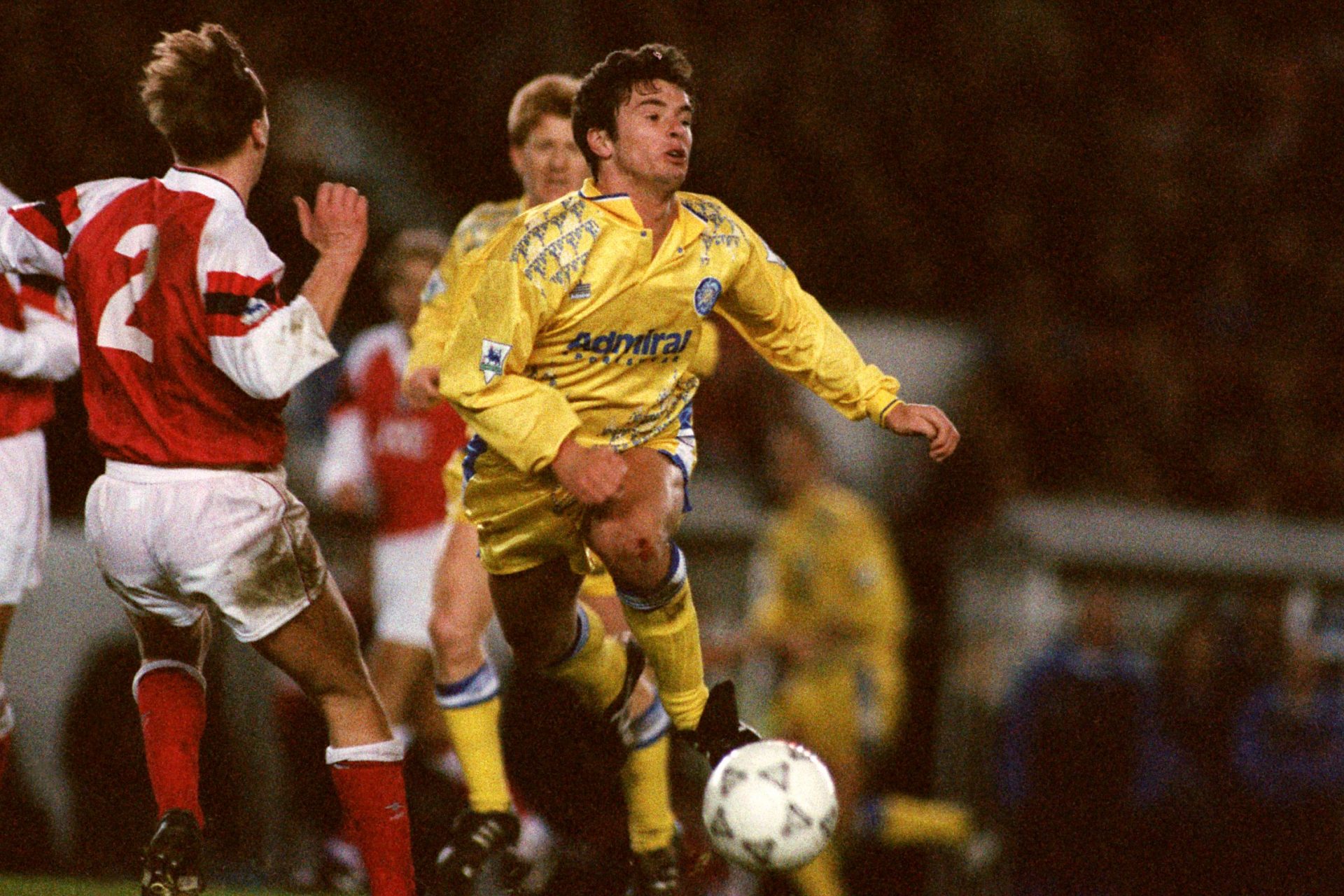
8. Chelsea (1994-96, Away)
Chelsea's yellow and blue away kit from the mid-90s is one that often comes up in discussions of the worst kits in Premier League history. The shirt featured a garish combination of bright yellow with electric blue pinstripes and a large blue collar. The overall design looked more like a throwback to the 80s with its clashing elements, and the oversized Coors beer sponsor logo made it even more of an eyesore.
Want to see more like this? Follow us here for daily sports news, profiles and analysis!
7. Tottenham Hotspur (2019-20, Third)
Tottenham’s third kit from 2019 featured a garish purple gradient that didn’t sit well with fans or critics. The kit was described as a visual mess, lacking cohesion and elegance – something the club likes to think it's known for.
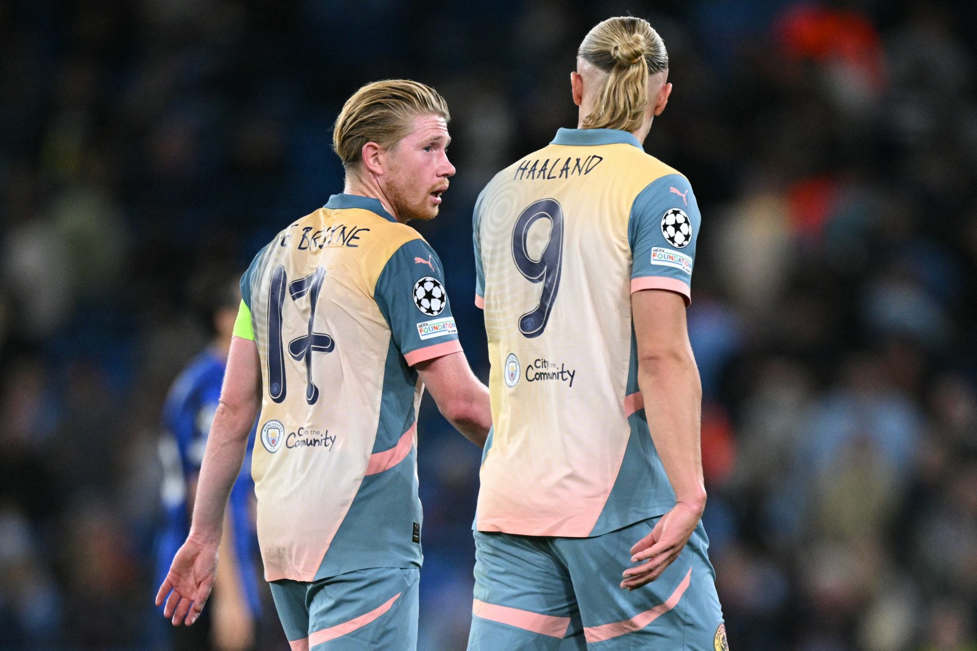
6. Manchester City (2024-25, Fourth)
We think it probably sits around here. City look more like a sherbert lolly than a serious football side in this number... Thankfully, we probably won't see it again.
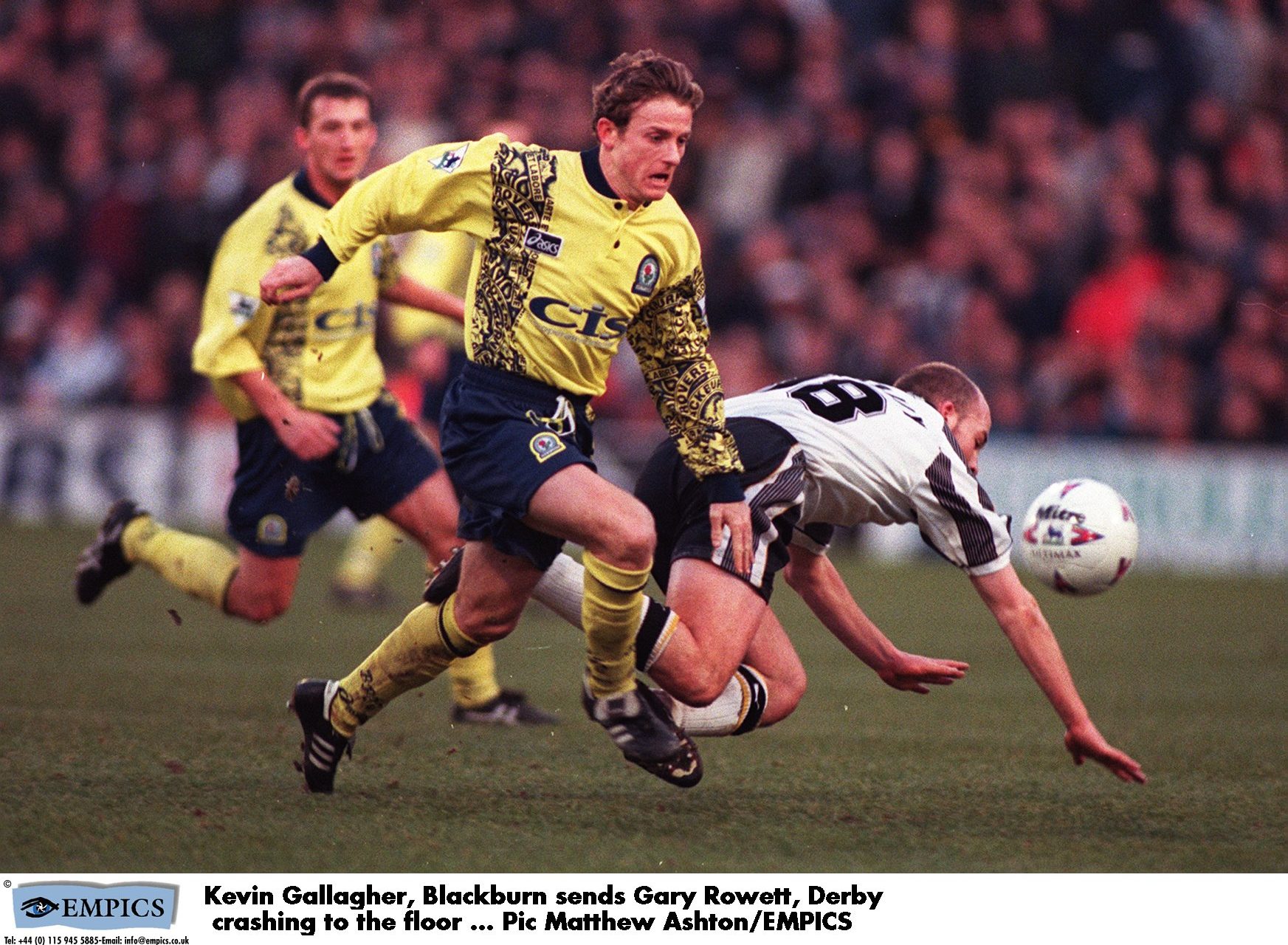
5. Blackburn Rovers (1996-98, Away)
The high-vis yellow colour was a bad start, but for us, it's the cartoon logoing of 'Blackburn Rovers' all over the sides that get it this far up. Looks more like a kid has gotten loose with a sharpie.
4. Sheffield Wednesday (1995-96, Away)
Sheffield Wednesday's away shirts for most of the 90s were clunkers. This teal number was rounded out with some very of the time patterned gradients that are oddly placed. It's a series of poor decisions in a row. Still, the home kit was an absolute banger.
3. Norwich City (1992-94, Home)
For a club that has gotten it wrong more often than right, the Norwich 'bird poop' kit from the early 90s is infamous for its wild green and yellow pattern, resembling a paint splatter or worse, stands tall. Though, like many 90s kits, it almost goes full circle from being so bad it's good... almost.
2. Manchester United (1995-96, Away)
This grey kit became infamous after a single match against Southampton on April 13, 1996, when Manchester United players struggled to see each other on the pitch, prompting Sir Alex Ferguson to order a kit change at halftime. The dull design lacked any character, and the incident made it one of the most talked-about kit disasters.
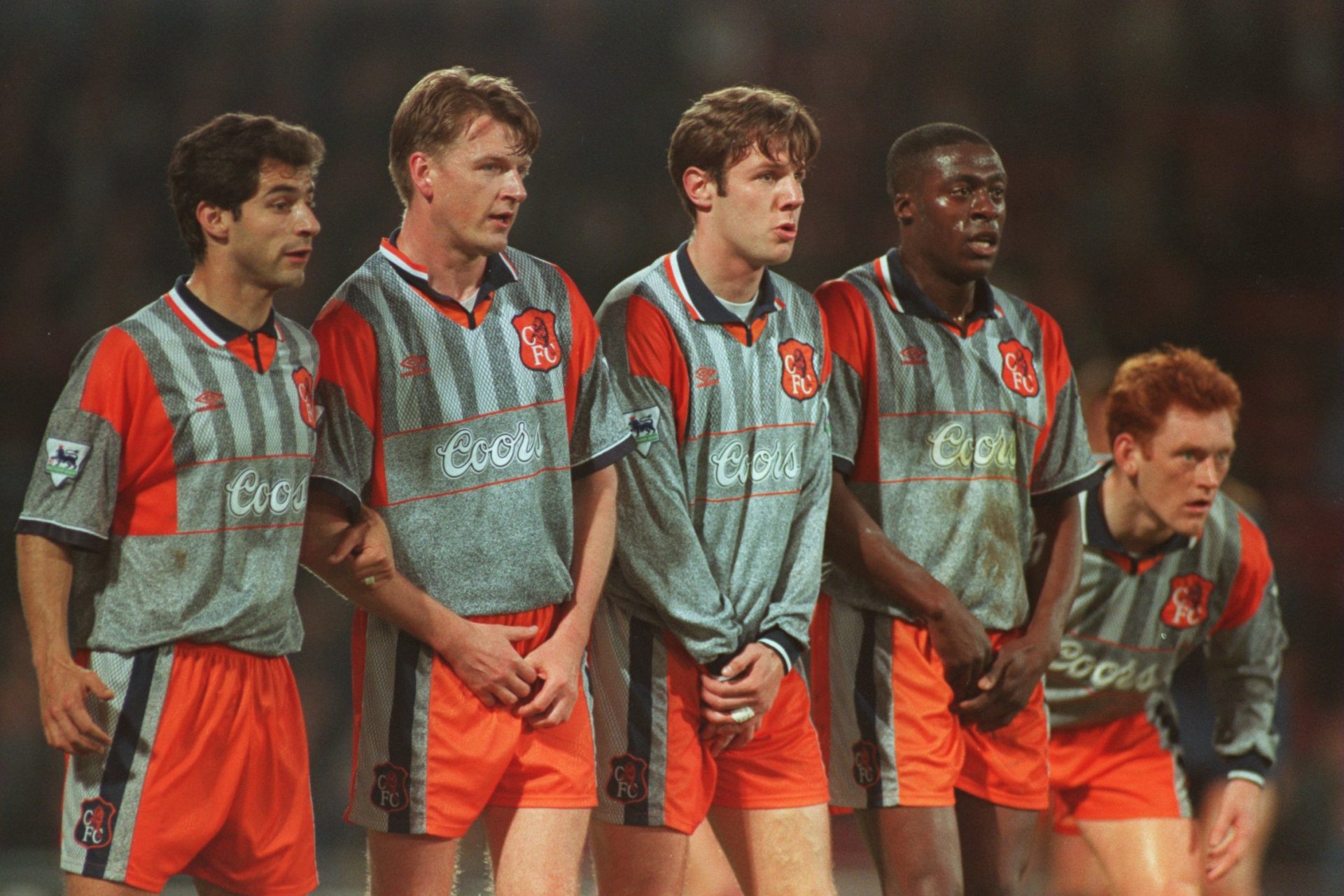
1. Chelsea (1994-96, Away)
Chelsea's orange and grey away shirt was an eyesore, with an awkward color combination that was more fitting for a roadside construction worker than a football pitch. It became an enduring symbol of 90s excess and poor design choices.
What did we miss?
Did we get this list wrong? Probably. There's been so many weird and wonderful kits in the Prem over the years, it's really hard to limit it to 15. Let us know what you think deserves a place on this list in the comments!
Want to see more like this? Follow us here for daily sports news, profiles and analysis!
More for you


Top Stories
1

Basketball
How the Caitlin Clark effect might cause a major disruption to the WNBA season
22 february, 2025
2
3
4
5

Basketball
How the Caitlin Clark effect might cause a major disruption to the WNBA season
22 february, 2025