


The Good, Bad And Ugly – Ranking each NBA team’s In-Season Tournament court design
From Masterpieces To Messes
For the first time in its history, the NBA has introduced an in-season tournament bundled into its regular season schedule. The league has taken many strides to help fans easily identify which games count towards the tournament. One of those measures was to implement alternate courts and jerseys for tournament games. We’ll rank the designs from visually abhorrent to downright perfect.
30. Chicago Bulls
Did somebody have a full can of red paint and a license to fling it at Chicago’s home court? There’s something to be said for seeing red in a situation involving bulls, but this takes it too far. The stenciled Bulls logo at center court in white seems like it was an afterthought behind the deluge of red that appears elsewhere on the floor.
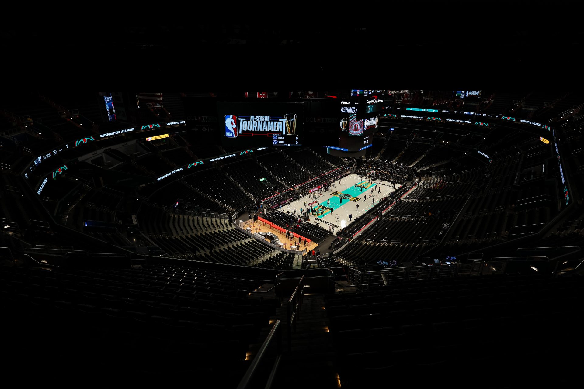
29. Washington Wizards
The Wizards’ in-season tournament court doesn’t make a whole lot of sense for their franchise. They have color schemes reminiscent of the 1990’s Vancouver Grizzlies, while implementing black lettering at each baseline. Additionally, they’ve used a fade-to-grey mechanism that doesn’t fit with everything else that’s taking place.
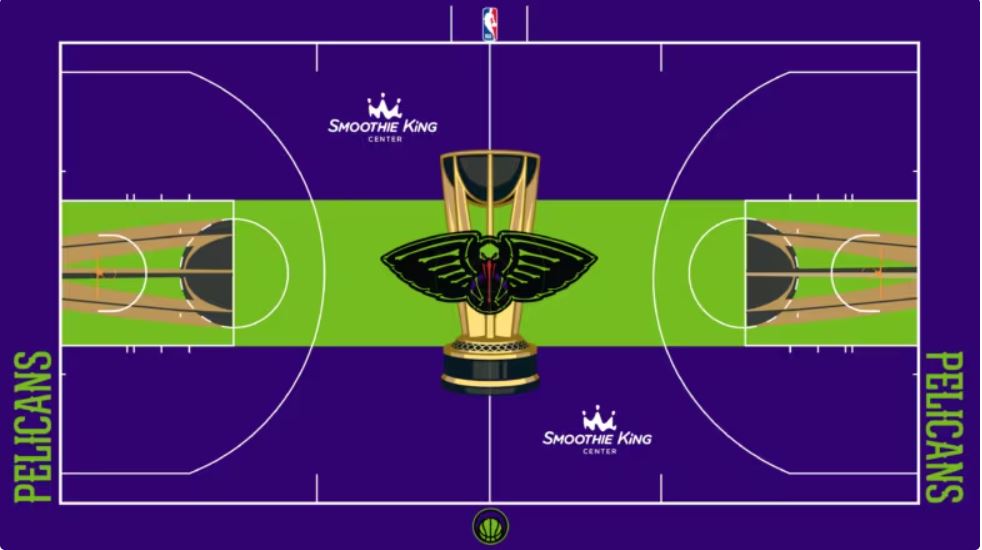
28. New Orleans Pelicans
There’s a slight argument to be made for New Orleans’ court if the logic involves the fashion of the old New Orleans Jazz in the 1970’s, but this design leaves a lot to be desired. Smearing the middle of the floor in bright green isn’t harmonious with the Pelicans brand. This seems more appropriate for a court that was slimed at the Nickelodeon campus.
Photo Credit: NBA.com
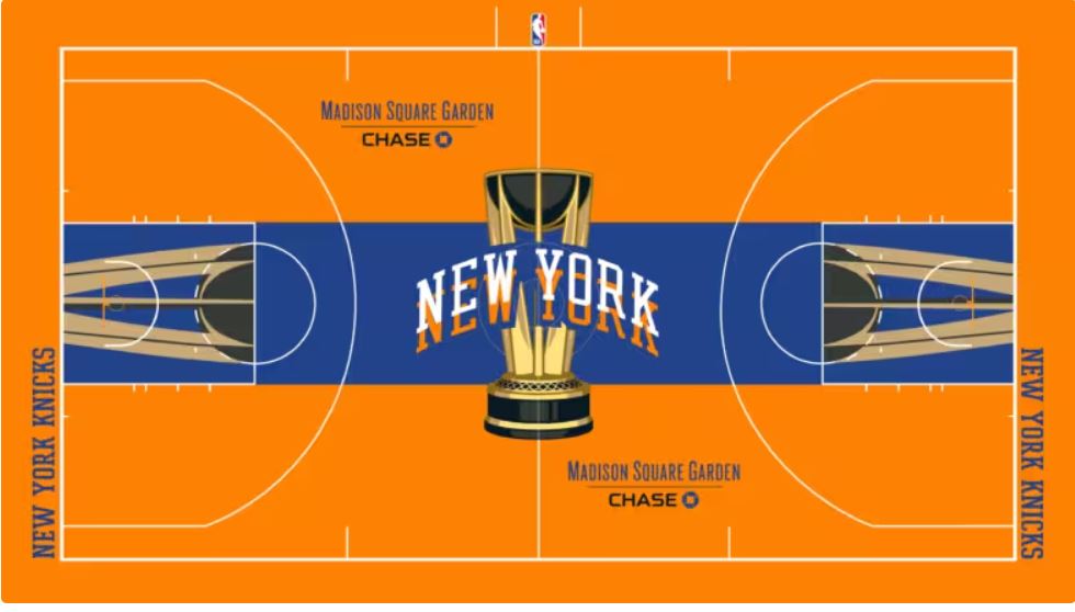
27. New York Knicks
New York is often referred to as “the city so nice that it was named twice.” With that said, there’s no reason for a disorienting pair of “New York” logos to appear at center court in different colors. Unless fans are going to receive IMAX 3D glasses at Madison Square Garden or watching at home, something a little less ambitious would have been a better move.
Photo Credit: NBA.com
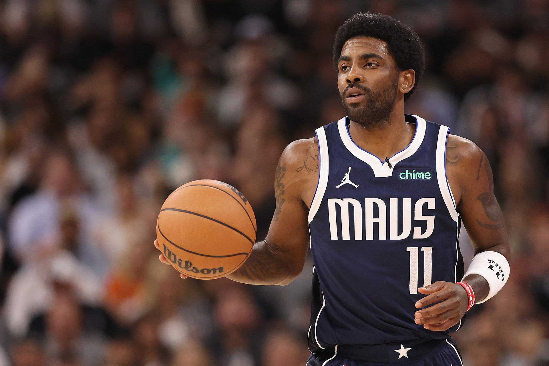
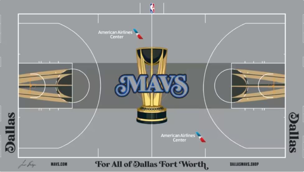
26. Dallas Mavericks
While we’ve already seen some teams optimistically try to switch things up for their in-season tournament court, the Mavericks didn’t accept the creative challenge. One of the main reasons why Dallas finds itself at the bottom of the list is because their floor is relatively mundane. They also opted for the fade-to-grey hue, but simply have the word “MAVS” spelled out at midcourt.
Photo Credit: NBA.com
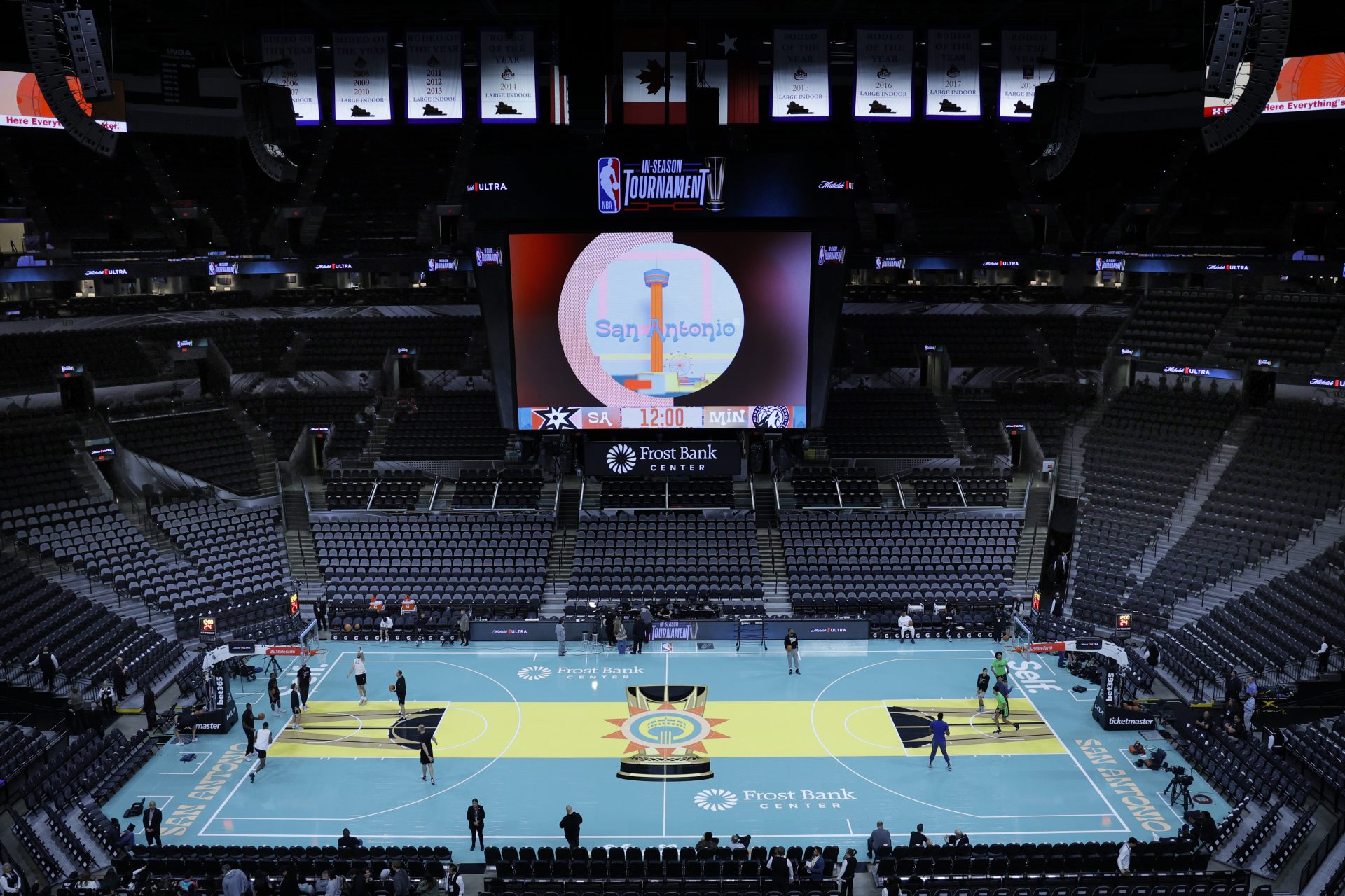
25. San Antonio Spurs
The intentions here were great, as the Spurs hoped to weave the Mexican heritage of their city into a court that uniquely represents them. The “Viva Spurs” at the bottom of the floor is a nice touch, but the central logo at midcourt is a bit on the busy side. With a couple of smaller tweaks, this court could have been ranked much higher.
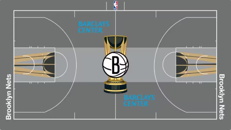
24. Brooklyn Nets
If the Mavericks’ staff didn’t put much effort into designing their in-season tournament court, the Nets’ team outright punted the assignment. Except for the paint and the trophy at midcourt, which is standard for all teams, Brooklyn’s court doesn’t look all that different from any other regular season game.
Photo Credit: NBA.com
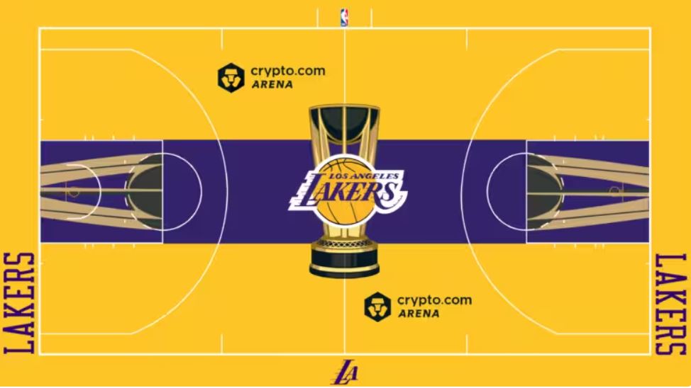
23. Los Angeles Lakers
The Lakers are another franchise that took the easy way out with in-season court design. It’s very similar to what they normally roll out during their other home games. The slight advantage Los Angeles has is their iconic logo and color scheme, so it’s possible a conscious decision was made not to deviate from it too much.
Photo Credit: NBA.com
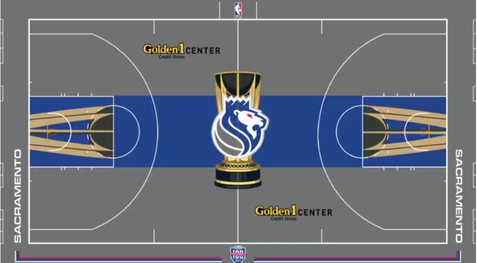
22. Sacramento Kings
Like San Antonio’s floor, Sacramento’s court had a chance to be viewed in much higher standing. The yellow “Golden1” lettering paired with the coloring of the trophy at midcourt makes for an enjoyable blend. However, it would have been nice for them to pick a central color other than royal blue to feature, which doesn’t resonate too much with the last 30 years of Kings basketball.
Photo Credit: NBA.com
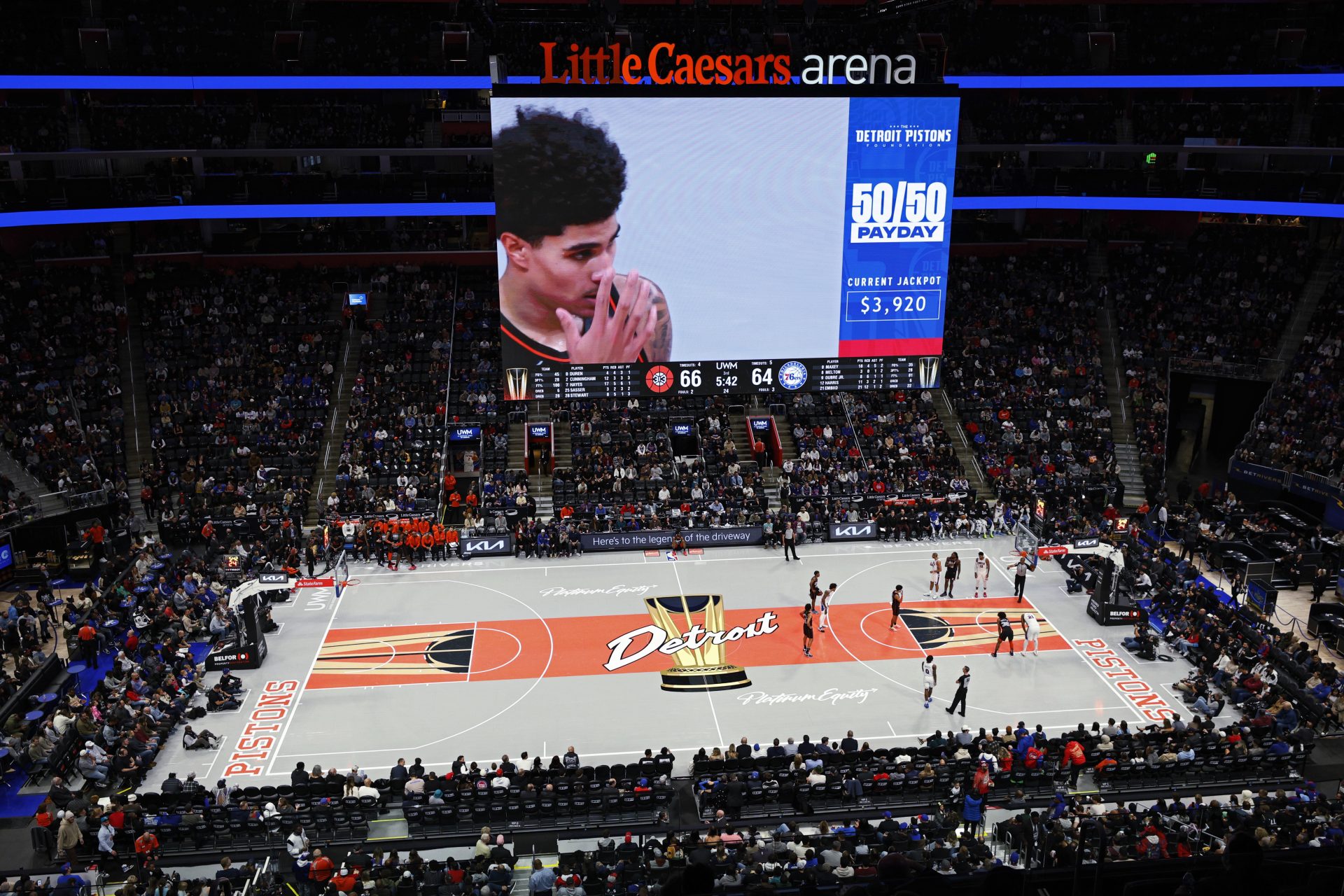
21. Detroit Pistons
Given the basketball culture in Detroit, it felt like the team could have done a lot more with their opportunity. While they might not have wanted to lean into the “Bad Boys” moniker from the late 1980’s, featuring “Detroit basketball” or something to that end would have made their design a little more appealing. Detroit in cursive writing seems too basic.
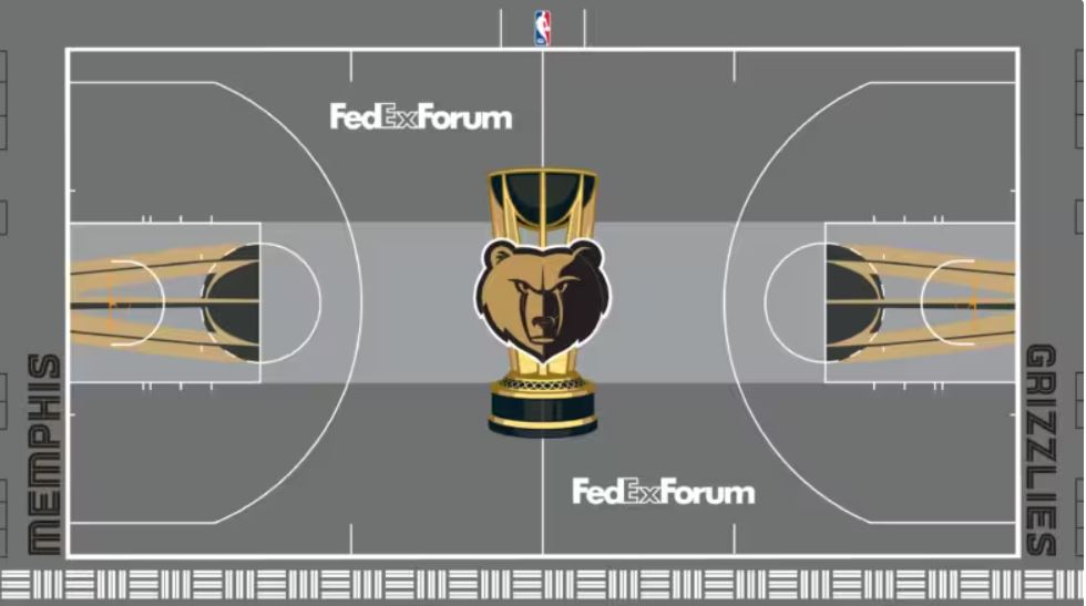
20. Memphis Grizzlies
The Grizzlies decided to embrace the grey with their alternate court. It’s a nice look, but it felt like a splash of color would have done them some good. The mystifying paint the Wizards used on their court would have been nice on Memphis’ floor, or a touch of the blue that is usually present on their jerseys.
Photo Credit: NBA.com
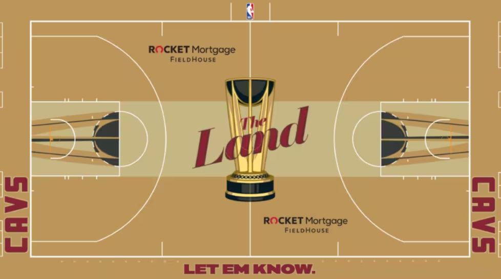
19. Cleveland Cavaliers
The wine and gold pairing the Cavaliers have rocked over the years is a staple of the franchise, and they leaned into it on their in-season court. The end result is pretty solid, as nothing on the court seems out of place from a color standpoint. “The Land” featured at midcourt over the trophy might be a bit forced for some, but it could be worse.
Photo Credit: NBA.com
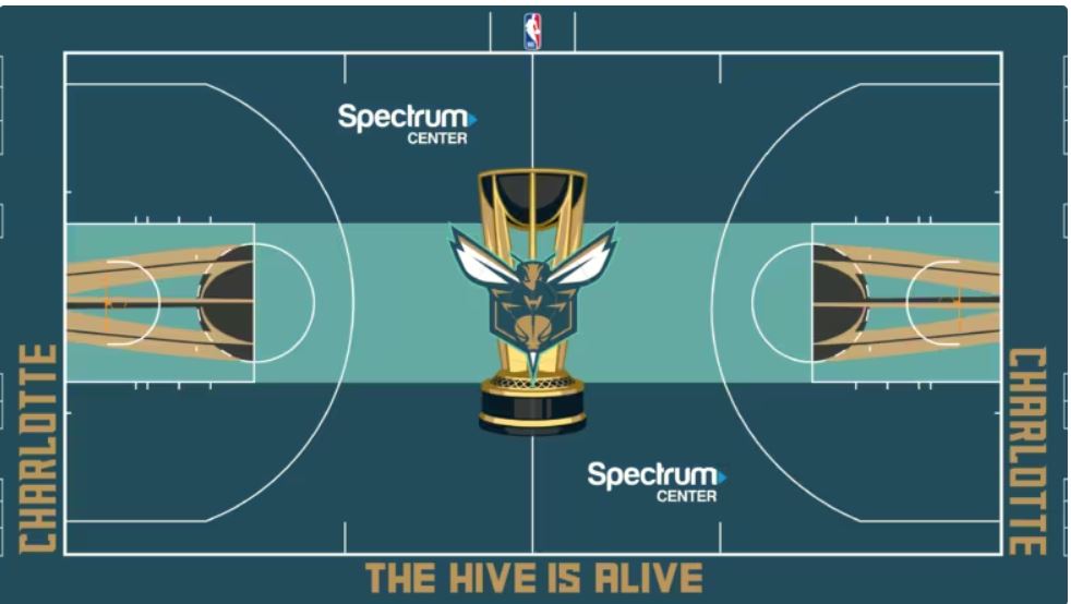
18. Charlotte Hornets
Part of a successful alternative court design can be the slogan displayed at the very bottom, and Charlotte has an excellent one. “The Hive Is Alive” is very catchy, and is sure to sell prominently on merchandise. The Hornets could have tried to implement the honeycomb design at midcourt or in the paint, but the viewing experience of this floor is decent.
Photo Credit: NBA.com
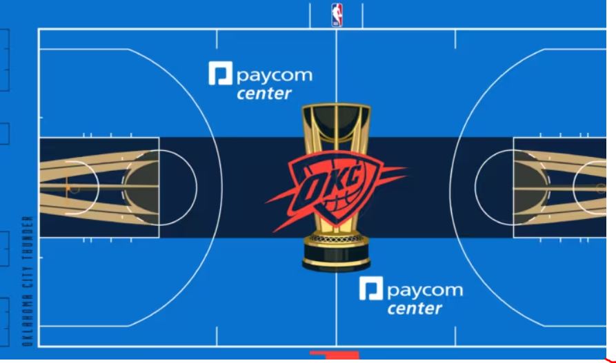
17. Oklahoma City Thunder
It feels like the Thunder didn’t quite know how to approach the assignment here. They stuck with their primary logo, and tossed in a splash of red with some blue on the perimeter of the court. The result of their efforts makes for an average outcome. There’s nothing egregiously wrong with what they did, but nothing special that stands out, either.
Photo Credit: NBA.com
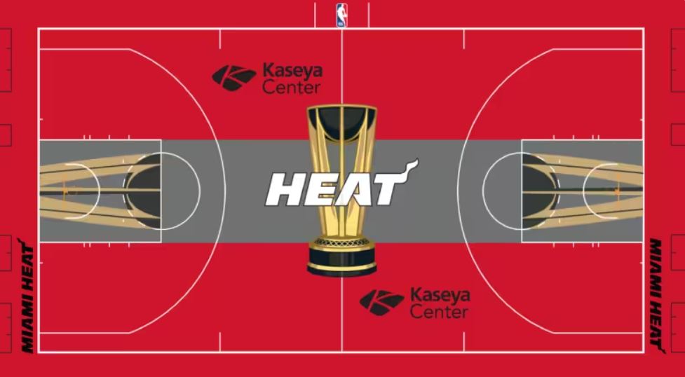
16. Miami Heat
Thankfully, the Heat didn’t make the same mistake as the Bulls by locking in on red exclusively. Their white logo at midcourt works much better as a breather from the strong red hue. Like a couple of other teams, they don’t get many points for creativity, as this looks like a court we may have seen during one of their NBA Finals games.
Photo Credit: NBA.com
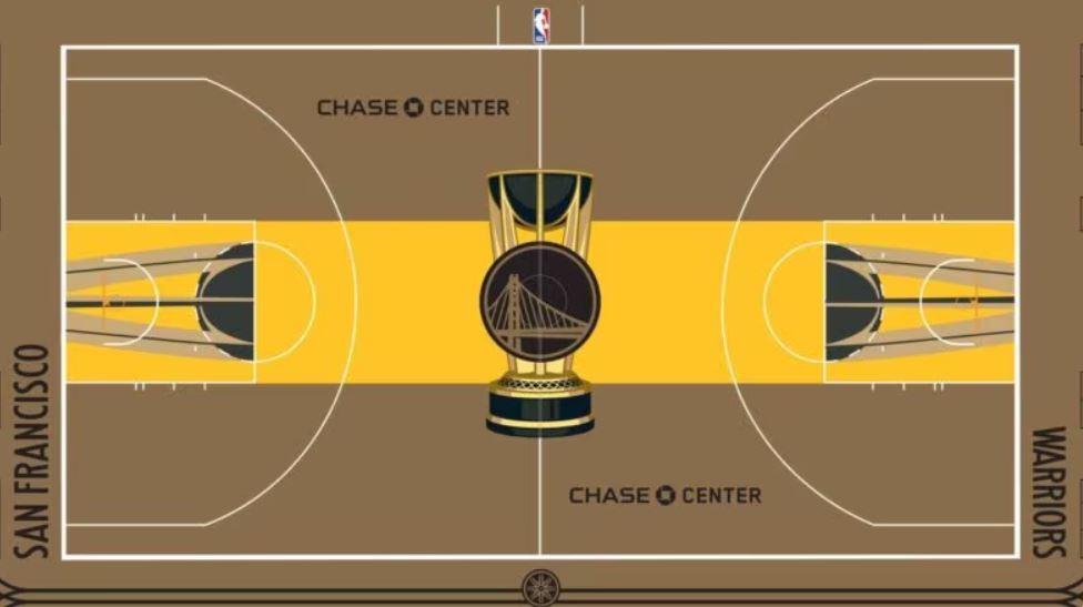
15. Golden State Warriors
The Warriors have been a proponent of the fade-to-color court styling, and deployed a light brown on the periphery of their in-season tournament hardwood. It goes fine with their traditional yellow, but it would have been nice to them to have the bridge on their logo pop a bit more, rather than fade into the background.
Photo Credit: NBA.com
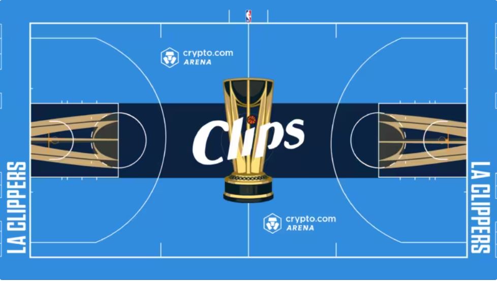
14. Los Angeles Clippers
The Clippers didn’t exactly go with a bold approach to their design either, but their floor is a crisp design that functionally works well. The blue and white they chose to use pair nicely with one another. The mini basketball as the dot in the “I” of “Clips” is a nice interspersion of red to break things up.
Photo Credit: NBA.com
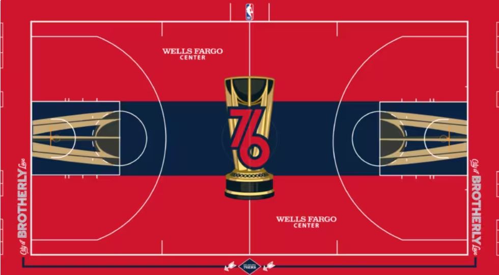
13. Philadelphia 76ers
While many teams elected to display a main logo over the trophy, Philadelphia decided to operate within its framework. The “76” in skinny font within the trophy is a clever idea, and the court blends its blue and red hues adequately. The “Brotherly Love” statement at either baseline also helps make this court uniquely Philadelphia’s.
Photo Credit: NBA.com
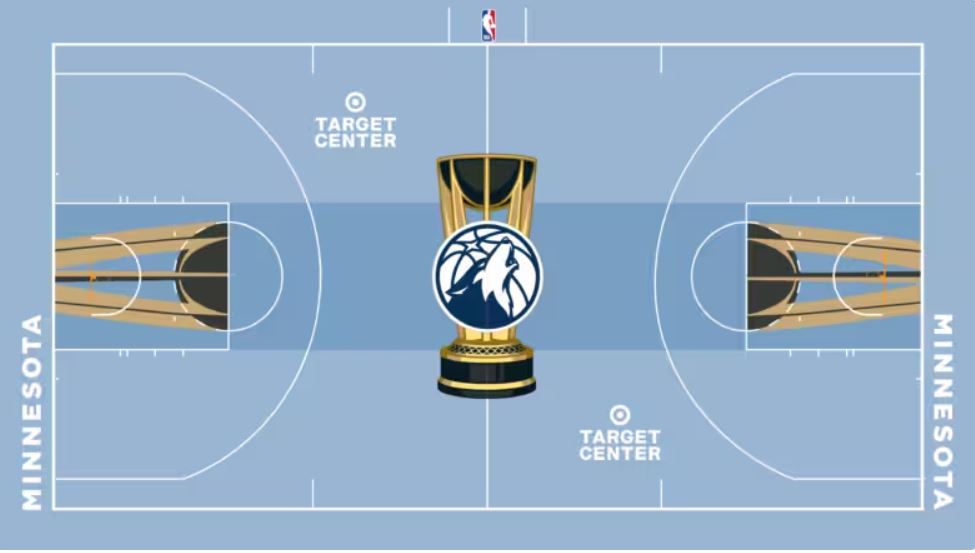
12. Minnesota Timberwolves
Given their many jersey designs over their history, Minnesota could have gone in many directions here. They chose to deploy a light blue as the backdrop for their court, with white lettering for their venue name and “Minnesota.” It was an effective decision, as the darker blue on the Timberwolf’s fur at midcourt really pops because of it.
Photo Credit: NBA.com
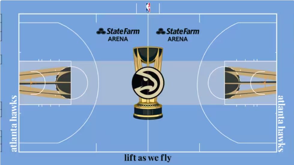
11. Atlanta Hawks
Atlanta and Minnesota seemed to have very similar design ideas, as their court concepts are pretty close to one another. Instead of leaning into their traditional red(which can be problematic, as we’ve seen), the Hawks embraced a light blue hue of their own. Their logo with a tinge of gold looks appealing as well.
Photo Credit: NBA.com
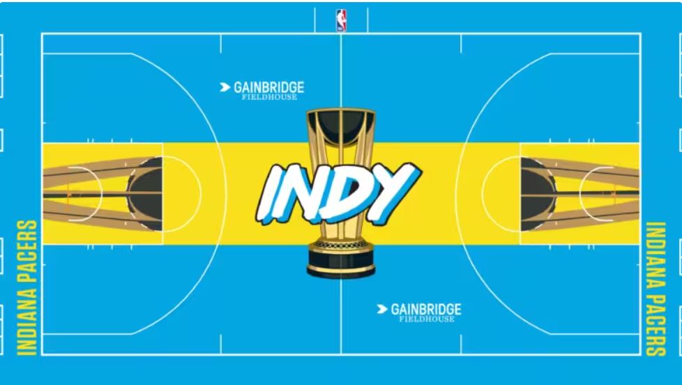
10. Indiana Pacers
There’s a joke to be made that the main designer of Indiana’s in-season court was a high schooler who used Microsoft Word’s bubble letter templates to get this assignment kicked off. Be that as it may, “Indy” at midcourt with an almost-UCLA color scheme really is a neat pivot to the Pacers’ usual look.
Photo Credit: NBA.com
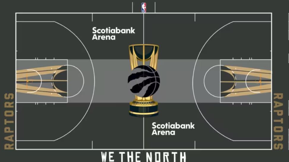
9. Toronto Raptors
It feels like the Raptors and their fans have the ability to pull almost anything off, and their choice to incorporate black, white and gold was tremendously effective. The gold “Raptors” letting fits nicely with the trophy color, and the white lettering for “Scotiabank Arena” and “We The North” gives the television viewer a retro feel.
Photo Credit: NBA.com
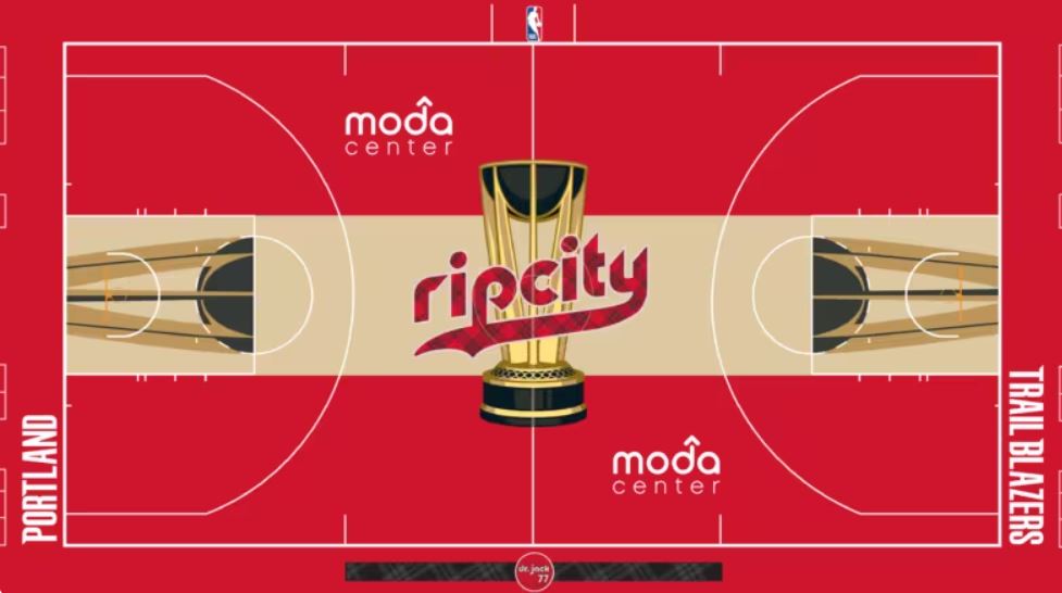
8. Portland Trail Blazers
Readers of this ranking list have become privy to the potential mishaps red can cause in a design, but Portland navigated around that nicely. Their patterned design used in their “Rip City” moniker at midcourt is well executed. While the rest of their look might be on the simplistic side, Portland didn’t make any decisions to mess things up, either.
Photo Credit: NBA.com
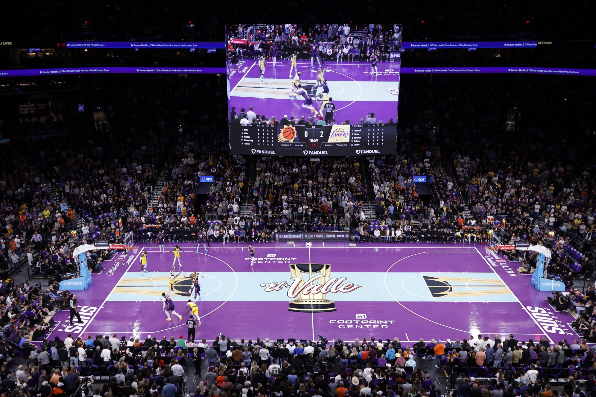
7. Phoenix Suns
There’s a chance that Phoenix’s court design could have tried to do too much, but their penchant for using bright colors in their franchise history helps make this court much more acceptable. The Suns leaned into “The Valley”, by placing the Spanish version of the saying at center court. The bright blue compliments the purple nicely as well.
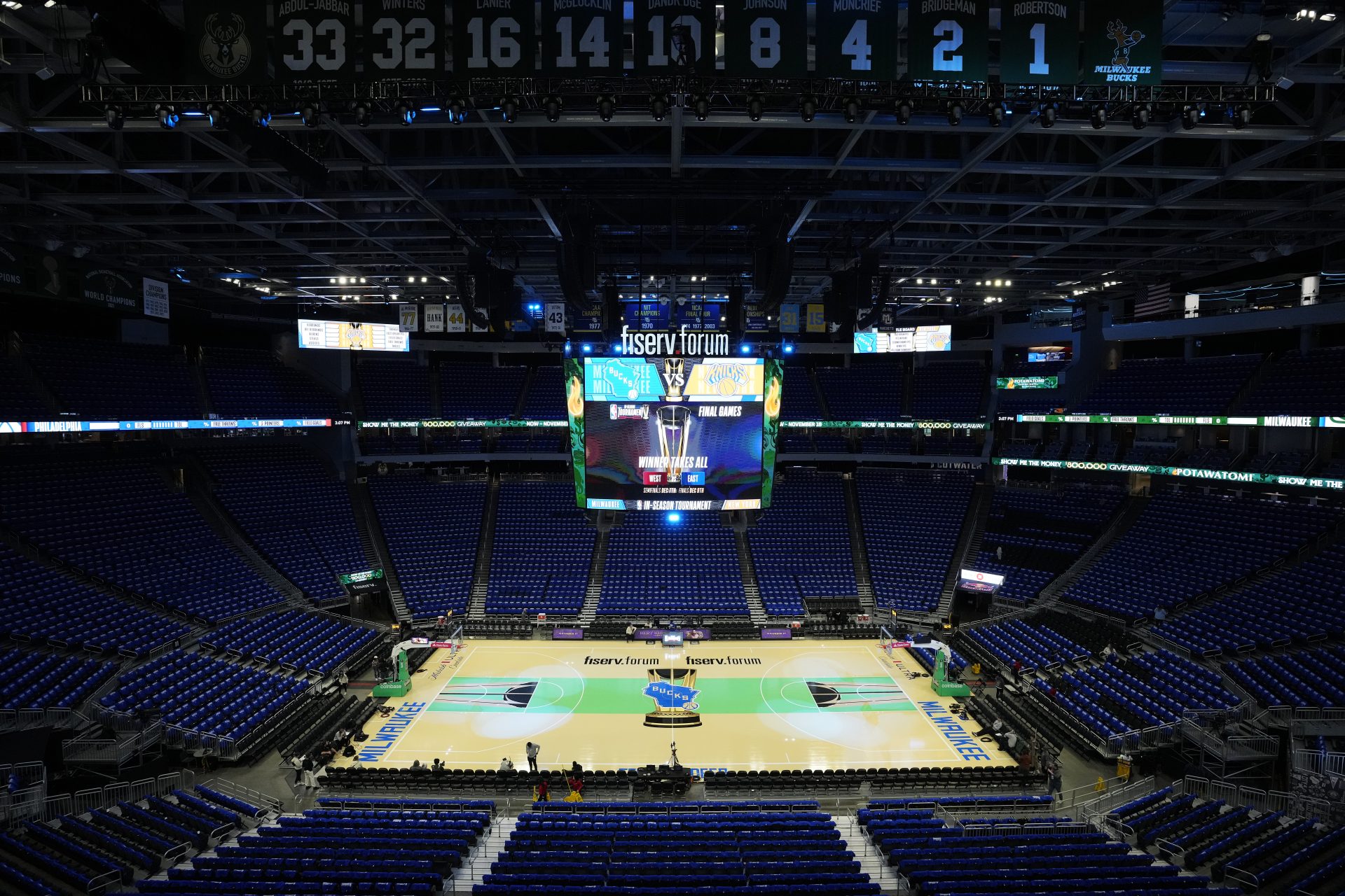
6. Milwaukee Bucks
The Bucks did an outstanding job with their in-season court, which is simple, organized and meaningful. The green connector rectangle is flanked by green lines at the bottom of the court which border “Fear The Deer”. The silhouette of Wisconsin with Bucks in the middle is also a winner. They could have colored “Fiserv Forum” letting blue as well to match, but it’s a minor nitpick.
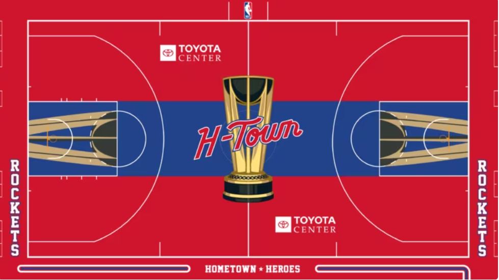
5. Houston Rockets
The red, white and blue courts tended to get average grades in this exercise, but Houston found a way to incorporate these colors extremely well. The Rockets’ court almost looks like something that could be featured as a classic high school floor, and that’s a compliment. The centralized “H-Town” logo perfectly fits in with everything else going on.
Photo Credit: NBA.com
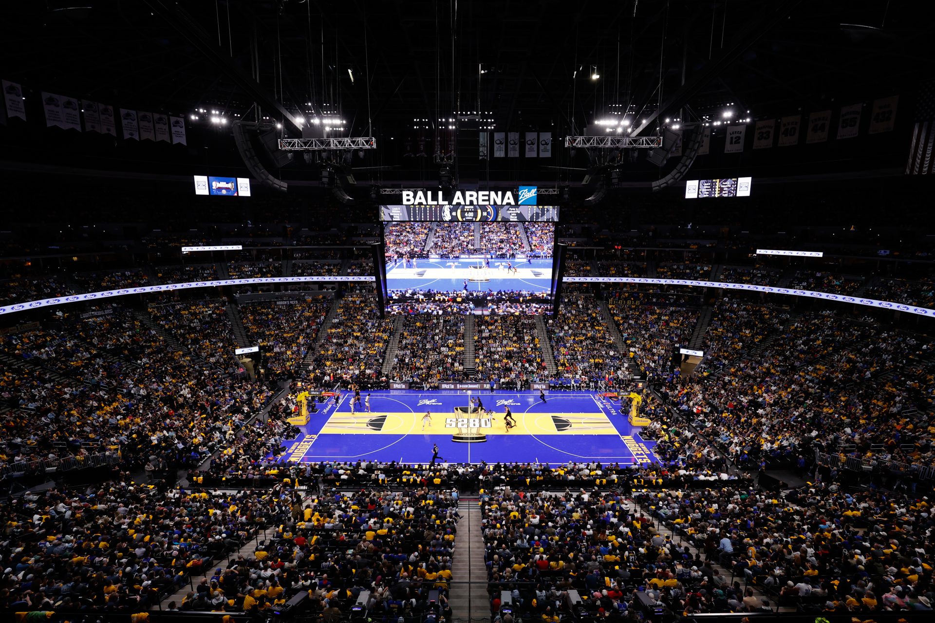
4. Denver Nuggets
Detractors of the Nuggets’ in-season tournament jerseys are fair to criticize “5280” appearing on player uniforms which already have other numbers. However, positioning the number of feet above sea level Denver is at midcourt is an incredible way to mess with opponents who may not be ready to play at altitude.
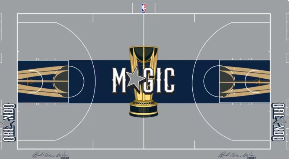
3. Orlando Magic
Some might have wanted Orlando to go with a brighter blue, but their decision to deploy a darker blue worked out perfectly. It makes for a clean, professional look through and through, and is a worthy partner of the grey that goes along with it. Using the “star” in place of the “A” in Orlando and “Magic” is always a winner too. While it may not be as fun, this floor certainly means business.
Photo Credit: NBA.com
2. Boston Celtics
Some might wonder why the Celtics’ floor design is so highly thought of when it doesn’t deviate too much from what Boston rolls out on a nightly basis. The difference is that Boston is NBA royalty when it comes to winning championships, and this court just feels right in relation to the history the Celtics franchise has.
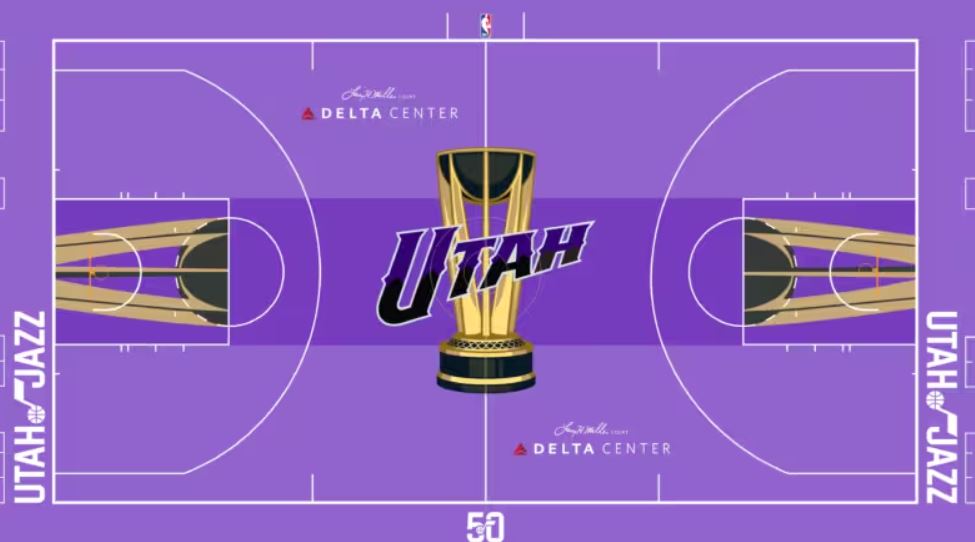
1. Utah Jazz
The Jazz decided to go back to their heyday in the 1990’s with the mountainous font and purple color scheme, and it paid off bigtime. The gradient purple used in “Utah” at center court hits all the right notes, and the lighter purple flanking the central rectangle looks great in contrast. The musical note with the basketball in the classic Jazz logo is still featured outside each baseline.
Photo Credit: NBA.com
More for you


Top Stories
1
2

Basketball
How the Caitlin Clark effect might cause a major disruption to the WNBA season
22 february, 2025
3
4
5

Basketball
How the Caitlin Clark effect might cause a major disruption to the WNBA season
22 february, 2025